Colour is everywhere.
Whether you recognise the influence on your life or not, the truth is that different shades and hues capture your attention and inspire your actions, altering your perceptions and behaviours daily.
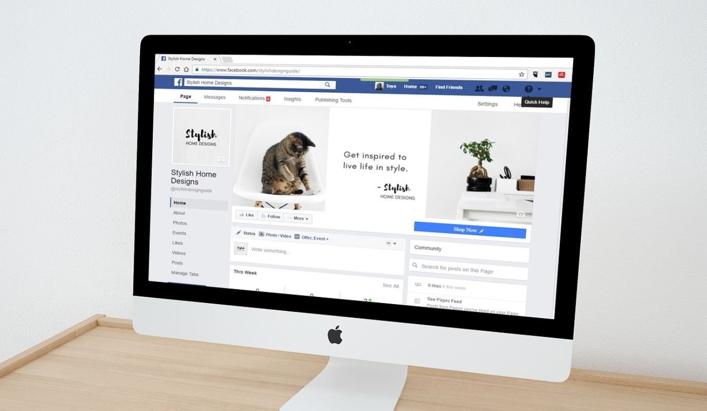
Have you ever wondered why stop signs are red? What about why companies like Facebook drown themselves in blue while organisations focused on growth and creativity choose green? The answer is in the psychology of colour and design. Each shade resonates with us on a different, and unique level.
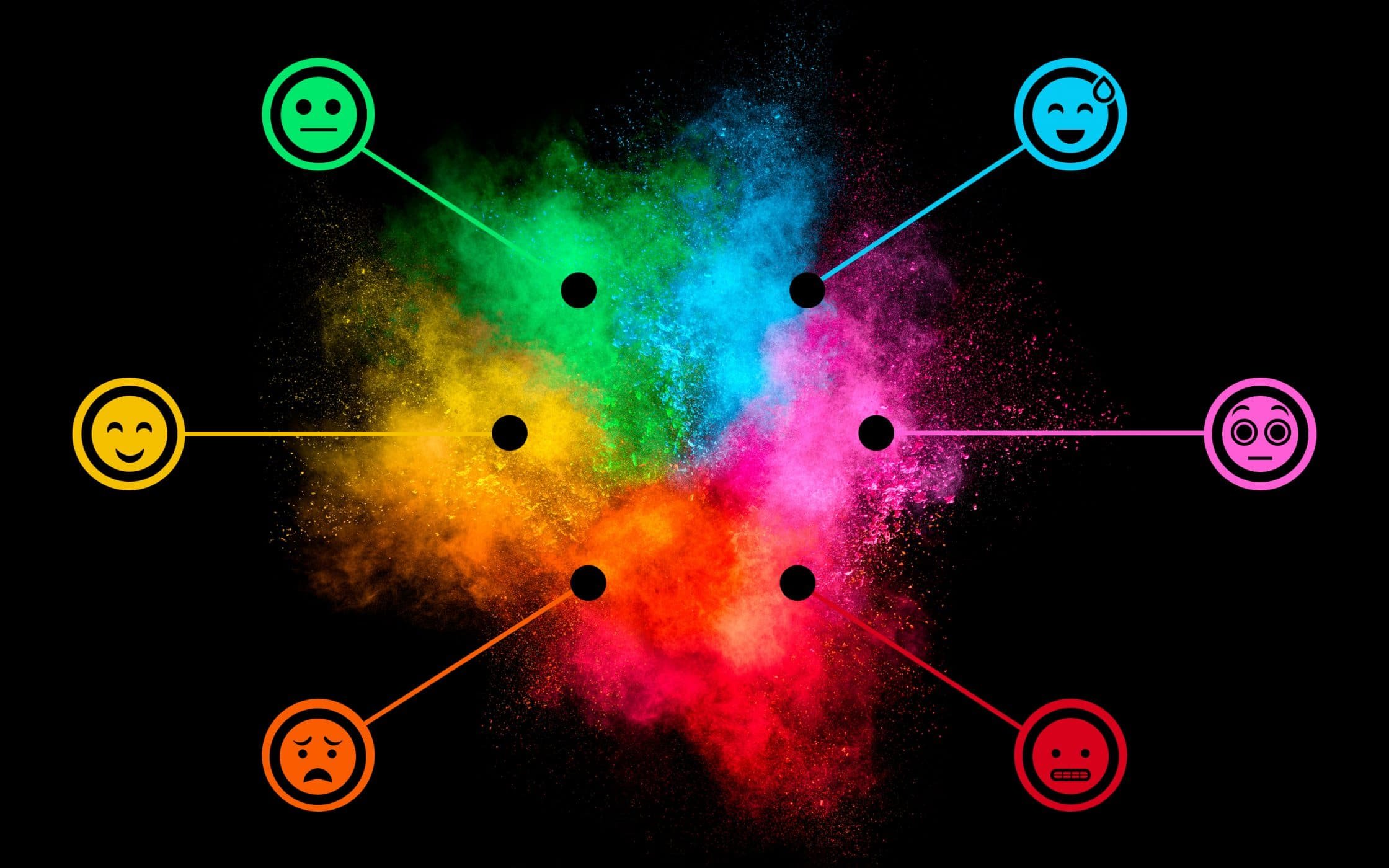
In fact, colour has even crept into our use of language. We say we’re “feeling blue” when we’re sad, that we’re “green with envy”, or that we’re “seeing red”. That’s because we naturally associate colours with moods and emotions.
When it comes to the psychology of colour in branding and marketing, research suggests that colours improve brand recognition by up to 80%. The chances are that when you envision big businesses like Coca-Cola, Facebook, and Starbucks, you can automatically recall the way they use colour.
In the world of branding, colour psychology is involved in everything from your logo design, to your marketing materials, and even the way you build your website. The key to success, is not only understanding what each colour means from a psychological perspective, but learning how your ideal customer will respond to the shades you choose in context.
Here, we’ll cover an introduction to the psychology of colour, and help you to understand how you can use colour in branding to inspire, invigorate, and engage your audience.
The psychology of colour in marketing and branding
Before we break down the psychology of colour in marketing and branding with a look into some of the most popular colours, it’s worth highlighting why it’s so important to choose the right pigments for your brand.
According to some studies, when human beings see colour our eyes send messages to a specific region in the brain known as the hypothalamus. The brain then activates the pituitary and thyroid glands, which promotes the release of hormones responsible for causing fluctuations in emotion, and behaviour.
In simple terms, colour plays an essential role in creating a strong first impression for your customers. However, not every person will respond to colour in the same way. One of the most significant problems with the psychology of colour and design, is that the meaning of certain shades can vary depending on cultural background and personal preference.
Colour psychology isn’t an exact science. Studies show that the way you use colour in branding will often be affected by individual perceptions. In fact, it’s not always the shade itself that has the biggest impact on your audience, but how “appropriate” that colour feels in the context of the brand that’s using it.
Of course, just because the psychology of colour is complicated, doesn’t mean it isn’t important. One research paper from the University of Winnipeg found that the initial judgements people make about products, and brands, are based almost entirely on colour. In fact, up to 90% of first opinions come from colour alone.
This means that everything from the hues you use in your brochure design, to the paints on your corporate walls, can’t be based on aesthetics alone. Instead, you’ll need to make sure that you do your research, to learn some of the most common perceptions associated with colour, and how you can use different shades to expand the potential of your brand personality and marketplace position.
Let’s take a look at the most common colours in branding, and what they mean:
Psychology of the colour blue
When it comes to examining the psychology of colour and design, it makes sense to start with the world’s favourite shade. As the colour of the sky, and sea, blue demonstrates clean, calm, and peaceful qualities.
According to colour psychology, this diverse shade demonstrates trustworthiness, security, and dependability. That makes sense when you consider the role it plays in the identity of companies like Facebook, Twitter, and AT&T. In fact, your local police department are probably decked out in blue.
Several industries use blue to showcase their personality, including the technology, lifestyle, and finance spaces. Customers trust these brands to allow them to communicate with friends, save money, and enjoy day-to-day aspects of their lives. That’s why the businesses choose blue to make customers feel safe and secure.
How to use this colour in branding:
Unlike emotionally “warmer” colours like orange, red, and yellow, blue is linked more to intellect and consciousness. It can work to promote high-tech products, depth, expertise, and stability. We already mentioned Facebook as an example of a tech-based company benefitting from the colour blue. However, the NHS is another great example.
The UK’s national health service uses a distinctive shade of blue to demonstrate its reassuring, cool, and secure characteristics.
Psychology of the colour green
Green is the colour most associated with nature, and growth. When connected to the psychology of colour in marketing and branding, green often communicates ideas of freshness, health, and all-natural qualities. However, darker shades of green can sometimes represent financial stability and wealth.
According to colour psychology, green is the easiest colour for the eye to process. It brings to mind ideas of progress, development, and serenity. The “natural” aspects of green explain why it’s so commonly used in the logos of brands like Starbucks and Wholefoods.
How to use this colour in branding:
For marketing and branding purposes, green is best used when you want to come across as a sustainable, organic, natural, or healthy brand. Green can also be used to indicate safety when advertising medical products.
Since darker greens have associations with prestige and wealth, deeper shades could also convey luxury. For instance, Harrods uses a combination of dark green and gold to showcase its focus on opulence.
Psychology of the colour red
Red is an incredibly powerful shade in the psychology of colour and design. It can communicate many different ideas depending on context. For instance, because it’s associated with fire, it can represent either warmth, or danger simultaneously. What’s more, red is generally connected to matters of the heart, making it a highly emotional pigment.
Most brands combine red with softer colours like white to indicate a sense of excitement, without risking the perception of danger, or aggression. After all, you want to engage your customer, without pushing them into an anxious state. For example, YouTube uses a combination of red and white to make their logo pop, creating a cinematic and exciting look.
How to use this colour in branding:
Red is ideal for bringing images and text right to the front of your customer’s vision. It can stimulate people into making quick decisions, and can be the perfect colour for “click here” or “buy now” calls to action on websites and banners.
The Vodafone logo features a distinctive red speech mark that symbolises talking, passion, and sound. For many brands, working with red can be difficult, as it’s tough to walk the line between excitement, and aggression.
Psychology of the colour purple
In the psychology of colour, purple is often associated with royalty – particularly in darker shades. On the other hand, softer pigments of lavender can link to femininity, nostalgia, and sentimentality. For most businesses, purple is the perfect go-to choice if you’re looking to portray an imaginative or creative brand, which is why it’s embraced by groups like Yahoo!, and the SyFy Network.
Companies like Cadbury’s use purple to indicate luxury and creativity at the same time. In fact, purple is so deeply ingrained with the Cadbury identity, that “Pantone 2685C” is officially recognised as Cadbury purple.
How to use this colour in branding:
Purple can be a tricky colour for some organisations to use. In the psychology of colour, darker shades of purple symbolise opulence, while lighter and brighter shades are more romantic, and emotional. Around 75% of pre-adolescent children prefer purple to other colours.
Because it’s a soothing and dreamy colour, it can be fantastic for both feminine, and feeling-based brands. For instance, Hallmark uses the shade across all their branding materials.
Psychology of the colour yellow
As the colour often attributed to light and sunshine, yellow typically communicates feelings of cheerfulness, and happiness. However, in certain contexts, it can also be used to signal warning, caution, and even quarantine.
Many businesses consider yellow to be an optimistic colour. It captures the attention of audiences from a distance, which makes sense when you consider the McDonalds golden arches that are designed to attract hungry travellers on the road.
How to use this colour in branding:
Bright yellow is fantastic at attracting attention, but it can also be distracting if it isn’t used with care. Generally, yellow should promote children’s products and cheerful things. However, it can also work in a positive way to indicate caution and dedication. For example, JCB use yellow to make sure that their potentially dangerous equipment and machinery is as eye-catching as possible.
Psychology of the colour orange
Finally, as a combination of red and yellow, orange is used to convey concepts of heat and light. It demonstrates both ambition, and pride, and offers many of the same benefits as red, without being quite as aggressive.
Orange is a friendly colour, and perfect for companies that are focusing on building brand loyalty. Used by everyone from Home Depot, to EasyJet, the bright and bold shade is designed to capture attention and inspire customers. According to Entrepreneur.com, subtle shades of orange can sometimes appeal to a more upscale market.
How to use this colour in branding:
Orange is a very warm colour, but it’s not as bold as red. Orange can increase the oxygen supply to the brain, producing an invigorating effect, and stimulating mental activity. Most of the time, it’s accepted virtually among younger people, as it’s potentially one of the must “fun” and interesting colours on the spectrum.
Brands like Nickelodeon have had plenty of success using orange alongside their unique tone of voice to inspire imagination among younger audiences. As a citrus shade, orange can work with the psychology of colour and design to inspire desire and hunger. That means that it’s particularly good for selling food and toys.
Tips for accessing the psychology of colour and design
It’s impossible to ignore the psychology of colour in marketing and branding. However, results from studies like the “Interactive Effects of Colours” demonstrate that the relationship between brand and colour hinges on the “appropriateness” of the colour used.
In other words, your company shouldn’t just cling to a shade because it’s appealing to you, or because you think that competitors in your space have done well using similar pigments. Purchasing intent, customer affinity, and brand relationships around colour all come down to how your customers view your personality, and identity.
Harley Davidson simply wouldn’t portray the same attitude of ruggedness and exploration if their logo was decked out in shades of purple and pink. Finding the right shades in relation to the psychology of colour means looking closely at your brand manifesto, and keeping the following concepts in mind.
1. Never underestimate the psychology of colour
Around 93% of customers examine visual appearance when making a purchasing choice. Additionally, research shows that most customers make a subconscious assessment about which brands or products to choose within 90 seconds of an initial viewing. Up to 90% of that assessment is then based on colour alone.
Underestimating the psychology of colour and design could be devastating for your brand. However, it’s not enough to simply choose the brightest, or most “trendy” shade. Instead, you need to think about colour appropriateness, and examine which pigments your customers feel go best with certain products. The psychology of colour dictates that different shades are viewed differently according to gender, experiences, and personal preferences.
One study conducted by the Cardiff Business School found that if you want your branding to work, you need to choose colours that fit the image of the service or product you’re selling. In other words, think about how you want clients to perceive you when you’re building your brand, and focus on what seems “relevant” to your industry. Health companies don’t typically use reds and yellows, while male-focused businesses generally steer away from pinks, purples, and other stereotypically “feminine” shades.
2. Know your audience
Since colour psychology is all about adjusting perceptions and adding weight to your brand recognition strategy, it’s important to make sure that you’re picking hues based on the preferences of a specific audience. There’s a huge difference between the preferences of genders when it comes to colour selection. While blue is the favoured colour for both genders, men often prefer bolder colours, while women opt for softer hues.
Before you settle on a colour pallet for your brand, think carefully about the psychographics and demographics of your intended audience. Often, user personas will be the most useful resource you have here. Remember, a 20-year-old male obsessed with technology and video games will often have different reactions to colour in branding than a 60-year-old mother.
Making the most of the psychology of colour in marketing and branding means choosing shades that resonate with your audience. For instance, a pink and yellow site colour might be a huge turn-off for those 20-year-old gamers, but it might be much more appealing for moms.
Once you know the ins and outs of your target audience, and which colours appeal best to certain emotions within them, you can select pigments that represent the key characteristics you want your brand to elicit. For instance, a professional law firm might choose dark, bold colours like blue and black to position itself differently to a child’s toy store.
3. Keep it real (be authentic)
Just because your business wants your product or brand to reflect a certain idea through your choices in colour and marketing materials, doesn’t necessarily mean that the path to success will always be that simple. Customers tend to know intuitively when brands and colours connect, and when their connections are authentic.
If your customer doesn’t agree with the “image” you’re trying to portray, then they’re likely to look elsewhere for a brand that feels more natural. Therefore sometimes, companies think that choosing a “popular” colour will help them to improve sales, but in truth, it simply sets them further apart from their audience.
Whether you’re creating a brand from scratch, or refreshing your brand with a whole new image, think about how you can portray yourself in an authentic way using colour. As an example, when Volkswagen introduced a new beetle, many of their billboards featured a green car. That wasn’t a typical colour for cars at the time, but it was perfect for communicating ideas of renewal, and rebirth.
Key points to keep in mind:
If you’re simply looking for a quick checklist to make sure that you never make dangerous choices with the psychology of colour and design, remember that you should always consider:
Customer expectations: Which shades seem the most “appropriate” based on your brand history, personality, and position.
Customer preferences: Are you choosing a colour that evokes trust in your consumers, and represents the hues they like most?
Brand message: What kind of emotions and characteristics is your brand trying to portray? Your use of colour should match these as closely as possible.
Competitor colours: The last thing you want is to be lost in a sea of competitors that look the same as you. Pay close attention to the colour of other brands, and try to make your company stand out.
Consistency: When you’ve come to a decision about the psychology of colour, and chosen the hues you want to use, you should ensure that they remain consistent over time. Constant colours can solidify the picture of your brand in your customer’s mind.
It’s time to consider colour in branding
The psychology of colour and design has been a focal concept in the branding world for some time. Over the years, countless companies have experimented with their brand message, through new logos and colour modifications. In fact, if you look back into the history of many of your favourite brands, you’re sure to see a few brand makeovers centred around the use of colour.
There’s also plenty of evidence in the marketplace that the wrong use of colour can damage your brand image for good. Pepsi once made a huge mistake by introducing ice blue vending machines into South East Asia. While light blue might be a refreshing colour in the western world, in Asia, ice blue is associated with mourning and death.
Research into the psychology of colour in marketing and branding teaches us that there’s a lot more to creating a powerful visual identity for your brand, than simply choosing shapes and shades that you think look good. Ultimately, you need to understand not just your marketplace and industry, but also your customers too, so that you can design the right impact for your brand.
Colour psychology is key when it comes to making sure that your brand identity has weight and power. Choosing a hue that embodies your brand personality can help you to convey a more authentic brand, and the process should never be left to a whim or a vote of popularity. The more you understand about the psychology of colour, the more you can make a decision based on scientific understanding and human behaviour
By examining your market, your competitors, your customers, and the purpose behind your brand, you can build a pallet for your company that’s based on a deeper understanding of how different shades can influence the thoughts and behaviours of your customers. That puts you in a perfect position to create loyalty, and affinity.
So, the question is, what are your brand’s true colours?
If you enjoyed this article, you might enjoy these too:
— Nostalgia marketing and the retro revolution
— How to define your unique selling point
— The gift of gossip: word of mouth marketing
— Why you need clearly defined brand values
- Read more...
- 0 comments
- 726 views